So following with my last post, I continued looking at into how I’m going to do a redesign. Or is it doing my actual design.
Naturally my kneejerk reaction is do an additive change on top of my current look of the website. Like just spiffying up the current look, tighten the UX…
However my work-memory pulled me out of that default engineer intent. I remember how I worked with my friend the UX designer. How I was amazed at his bravado of making a ton of changes in multiple versions of the app we were building. Not everyone survives through Art Center, it seems. Those who do make it - become exceptional.
Ask me to write 5 different versions of the code behind the app. I would be stressed and pissed off at the management telling me to do so. That’s why I’m still learning to be a pro.
Anyways that is what I remembered, and that’s what the book Hello Web Design was telling me to do. Take a step back. Let’s do this by the book. Step by step.
So I’ve looked at three sample websites - Chipotle, KFC, El Pollo Loco - and took screenshots. Looked at what could work with my business setting. I was surprised at the inspirations I was getting.
For instance, these are franchises, so there’s always the location selection step. Don’t need.
Each menu item has modification steps to modify / sub-select menu items chosen. Sure, it’s nice to have, but in the spirit of agile development, I decided to punt that idea. My goal is to do the bare minimum, enough for a customer to see, like, and buy.
But what I found pretty cool was that all three sample websites had their cart show on the right hand side panel, while user can continue adding/ look at the options available to the user! Interesting. How design converges to that type of UX flow.
If they all do it, that must be the easiest, cleanest way to do that flow, so I decided to adapt and change that part to be as such.
In the steps to fill in the contact, address, and credit card info - all three would temporarily hide the menu items selected! That doesn’t jive with my personality. I don’t want to lose what I chose even for a second - but I’ll just follow them for now. Maybe it’s just me - I slightly have a tendency to keep everything I’m working on laid out on the desk until it’s finished.
So yeah, the author of the book (Hello Web Design) wasn’t wrong! If I just jumped in to straight up coding, I wouldn’t have even thought of creating multiple versions because I’d be encumbered by the time it took to code up the design.
However since I’m just sketching roughly, I was able to freely explore some other versions of the steps. What if I add the button at the button, enlarge it, instead of just at the bottom of the right column?
While I was looking at the three sample websites for inspiration, I gotta say - Chipotle’s website and UX flow was super weird.
I felt it was way to simple, but it was so clean and to the point. I felt like I was in line getting an order in Chipotle brick and mortar store, yet I didn’t feel that intent (that was probably the expected feeling) to be corny. It felt hip. It felt clean, and just enough undertone of that analogy to an actual Chipotle store.
Oh my gosh, what did I just write.
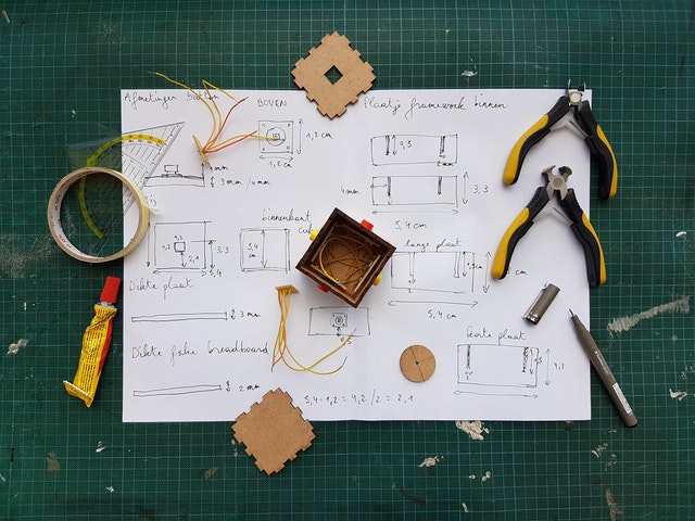
I .. I’m gonna stop here. Below picture is what I drew today doing this, and starting next week I’m gonna start coding it up.
Oh yeah, the book said to go through wireframing, but I think I can go straight to coding because I think I’m okay with CSS. Also, for me it is kind of a wireframing session - I’m just using HTML/CSS instead of Figma or Inkscape, as I don’t see too much friction doing so under setting of TailwindCSS + Phoenix.


